Customizes the colors of a subclassed editline.
Usage
Set_Property(OLECtrlEntID, "OLE.CustomColors[CtrlId]", Colors)
Values
Colors has the following structure:
| Pos | Name | Type | Description | Default |
|---|---|---|---|---|
| <1> | Colors used when editline is at rest | |||
| <1, 1> | Border Outer Color | Color Fill | Borders are two pixels thick. This is the color used to render the outermost pixels around the border. | "3DShadow" |
| <1, 2> | Border Inner Color | Color Fill | Borders are two pixels thick. This is the color used to render the innermost pixels around the border. | "Window" |
| <1, 3> | Option/Combo Button Color | Color Fill | The color used to render the option button or combo box button, if there is one. | "Window" |
| <1, 4> | Dropdown Arrow Color | Color Fill | The color used to render the option button or combo box button arrow, presuming no button image was specified. | "Black" |
| <1, 5> | Option/Combo Padding | Integer | The number of pixels between the button and the edges of the control. | 0 |
| <2> | Colors used when editline has focus | |||
| <2, 1> | Border Outer Color | Color Fill | Borders are two pixels thick. This is the color used to render the outermost pixels around the border. | "3DShadow" |
| <2, 2> | Border Inner Color | Color Fill | Borders are two pixels thick. This is the color used to render the innermost pixels around the border. | "Window" |
| <2, 3> | Option/Combo Button Color | Color Fill | The color used to render the option button or combo box button, if there is one. | "Window" |
| <2, 4> | Dropdown Arrow Color | Color Fill | The color used to render the option button or combo box button arrow, presuming no button image was specified. | "Black" |
| <2, 5> | Option/Combo Padding | Integer | The number of pixels between the button and the edges of the control. | 0 |
| <3> | Colors used when editline is hot | |||
| <3, 1> | Border Outer Color | Color Fill | Borders are two pixels thick. This is the color used to render the outermost pixels around the border. | "3DShadow" |
| <3, 2> | Border Inner Color | Color Fill | Borders are two pixels thick. This is the color used to render the innermost pixels around the border. | "Window" |
| <3, 3> | Option/Combo Button Color | Color Fill | The color used to render the option button or combo box button, if there is one. | "Window" |
| <3, 4> | Dropdown Arrow Color | Color Fill | The color used to render the option button or combo box button arrow, presuming no button image was specified. | "Black" |
| <3, 5> | Option/Combo Padding | Integer | The number of pixels between the button and the edges of the control. | 0 |
| <4> | Colors used when editline is disabled | |||
| <4, 1> | Border Outer Color | Color Fill | Borders are two pixels thick. This is the color used to render the outermost pixels around the border. | "3DShadow" |
| <4, 2> | Border Inner Color | Color Fill | Borders are two pixels thick. This is the color used to render the innermost pixels around the border. | "Window" |
| <4, 3> | Option/Combo Button Color | Color Fill | The color used to render the option button or combo box button, if there is one. | "Window" |
| <4, 4> | Dropdown Arrow Color | Color Fill | The color used to render the option button or combo box button arrow, presuming no button image was specified. | "Black" |
| <4, 5> | Option/Combo Padding | Integer | The number of pixels between the button and the edges of the control. | 0 |
Indices
| Index | Description |
|---|---|
| CtrlId | Identifies a subclassed control |
Remarks
Applies To: EDITLINE, EDITBOX
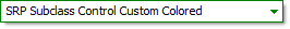
Don't let the big multi-valued structure of this property scare you. It's really quite simple. The example below shows how easy it is to create a green themed editline with a dropdown button.
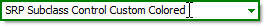
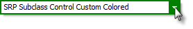
For the border, you specify two colors: one for the outer border and one for the inner border. Editline borders are 2 pixels thick, and allowing you specify both the out pixels and the inner pixels separately gives you greater control over the final look and feel. So, in the above images, we used two different colors for the border. We used "Green" for the outer pixel and "Window" for the inner border. This makes the border look thin when it doesn't have focus. For the other states, however, we made both the inner and outer pixels "Green" so that the editline stands out to the user.
The option/combo button padding is important if you want some space between your button and the border. We used a value of "2" because we didn't want the button to obscure the border. A value of "0" (the default) means your button will appear over the border. Note that the padding only effects the top, right, and bottom of the button.
Example
// Subclass my editline control and add an option button to it
CtrlId = @Window:".EDITLINE"
Handle = Get_Property(CtrlId, "HANDLE")
rv = Send_Message(@Window:".OLE_SUBCLASS", "OLE.Subclass", Handle, CtrlId)
Convert "." to ";" in CtrlId
Set_Property(@Window:".OLE_SUBCLASS", "OLE.OptionButton[":CtrlId:"]", 1)

// Now define my custom colors
Colors = ""
Colors<1> = "Green"   :@VM:"Window":@VM:"White" :@VM:"Green"   :@VM:2   ; // Normal State
Colors<2> = "Green"   :@VM:"Green" :@VM:"Green" :@VM:"White"   :@VM:2   ; // Focus State
Colors<3> = "Green"   :@VM:"Green" :@VM:"Green" :@VM:"White"   :@VM:2   ; // Hot State
Colors<4> = "3DShadow":@VM:"3DFace":@VM:"3DFace":@VM:"3DShadow":@VM:2   ; // Disabled State

// And set them
Set_Property(@Window:".OLE_SUBCLASS", "OLE.CustomColors[":CtrlId:"]", Colors)