The colors and patterns used to draw a pane.
Usage
Set_Property(OLECtrlEntID, "OLE.PaneColors[index]", Array)
Values
Array has the following structure:
| Pos | Name | Type | Description | Default |
|---|---|---|---|---|
| <1> | Text Color | Color | The color used to render the pane's caption | MenuText |
| <2> | Background | Color Fill | The color/pattern used to draw the pane's background | 3DFace |
| <3> | Progress Text Color | Color | The color used to render the portion of pane's caption that is over the progress bar | SelectText |
| <4> | Progress Background | Color Fill | The color/pattern used to draw the pane's progress bar | Select |
| <5> | Extend Progress Fill | Boolean | Determines if the progress fill pattern should extend the length of the pane, clipping away that which isn't visible | 0 |
| <6> | Extend Progress Border | Boolean | Determines if the progress border should extend the length of the pane, clipping away that which isn't visible | 0 |
Indices
| Index | Description |
|---|---|
| index | Index to an existing pane |
Remarks
The PaneColors property provides you with the ability to customize the look and feel of a pane. The first two fields can be applied to all types of panes. The Text color establishes the Color used to render the pane's caption. The Background field is a Color Fill used to draw the pane's background. You can set either of these to "None" or "Auto" to use the defaults.
The second two fields apply only to progress bar type panes. The Progress Text Color field sets the color used to render the text, but only the portion that appears above the current progress bar. The Progress Background field is a Color Fill used to draw the progress bar itself. You can set either of these fields to "None" or "Auto" to use the default settings.
The last two fields provide some flexibility in the way that the Color Fill pattern is used to draw the progress bar. The Extend Progress Fill flag, which set to 1, will render the fill pattern as if the progress bar was at 100%, clipping away the portion of the fill pattern not yet visible. The Extend Progress Border flag performs the same operation on the pane's border. These flags are useful for horizontal gradient fills that need to maintain their proportion.
Here are screenshots of the same color fill applied with all possible combinations of the aforementioned flags:
ProgressFill = "Horizontal(Gradient(White, Red, 30%), Red, Gradient(Red, White, 30%), Border(Black))"
| ExtendProgressFill = 0, ExtendProgressBorder = 0 (Default) | 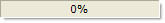 |
| ExtendProgressFill = 1, ExtendProgressBorder = 0 |  |
| ExtendProgressFill= 0, ExtendProgressBorder = 1 |  |
| ExtendProgressFill = 1, ExtendProgressBorder = 1 |  |
XP Theme
You can apply the XP theme to either the progress bar background (field 2) or the progress bar itself (field 4). Simply set either of these fields to "XP" to enable theming. Note that setting field <4> to "XP" only works with panes whose PaneType are "Progress Blocks" or "Progress Marquee".
Example
// Use a gradient style background and progress bar
Colors = ""
Colors<1> = "MenuText"
Colors<2> = "Horizontal( Gradient(3DS, 3D), Gradient(3D, 3DS) )"
Colors<3> = "SelectText"
Colors<4> = "Vertical( Gradient(S L=30, S), Gradient(S, S L=30), Border(S L=30) )"
rv = Set_Property(@Window:".OLE_STATUSBAR", "OLE.PaneColors[All]", Colors)

* Use XP Themed progress (<4> doesn't apply to all progress bar styles)
Colors = ""
Colors<1> = "Black"
Colors<2> = "XP"
Colors<3> = "Black"
Colors<4> = "XP"
rv = Set_Property(@Window:".OLE_STATUSBAR", "OLE.PaneColors[All]", Colors)