A tab's custom colors.
Usage
Set_Property(OLECtrlEntID, "OLE.TabColors[index]", Array)
Values
Array has the following structure:
| Pos | Name | Type | Description | Default |
|---|---|---|---|---|
| <1> | Normal Colors | |||
| <1, 1> | Normal Text Color | Color | The tab's text color in its normal state | "None" |
| <1, 2> | Normal Backgroun | Color Fill | The tab's background in its normal state | "None" |
| <2> | Hot Colors | |||
| <2, 1> | Hot Text Color | Color | The tab's text color when hot | "None" |
| <2, 2> | Hot Background | Color Fill | The tab's background when hot | "None" |
| <3> | Select Colors | |||
| <3, 1> | Select Text Color | Color | The tab's text color when selected | "None" |
| <3, 2> | Select Background | Color Fill | The tab's background when selected | "None" |
| <4> | Disable Colors | |||
| <4, 1> | Disable Text Color | Color | The tab's text color when disabled | "None" |
| <4, 2> | Disable Background | Color Fill | The tab's background when disabled | "None" |
| <5> | Pane Background | Color Fill | The pane background to be used when the tab is selected | "None" |
Indices
| Index | Description |
|---|---|
| index | Index to an existing tab. |
Remarks
The TabColors property allows you to customize the tab's text and background colors. By default, these are set to "None", which means that the current Windows theme is used to render the tabs. There is an important rule you need to know when using custom colors.
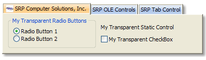
First, the AllowXPTheme property must be set to 0, even if you haven't yet set the property to 1. This ensures that the other controls on the form are properly subclassed. Failing to do so will result in something like this:
Setting the AllowXPTheme to 1 will force the tab to use XP themes, in which case, the TabColors property is ignored. Once again, set AllowXPTheme to 0 if you want to use custom colors.
With that out of the way, let's discuss color pairs. The first four fields of this property represent four color pairs. The color pair used depends on the state of the tab: normal, hot, selected, and disabled. So, if a tab is selected, then the color pair in field <3> is used. If the mouse is hovering over the tab, then the color pair in field <2> is used. Etc.
Color Values
By default, all colors are set to "None". A color with this value tells the tab to use a default color in its place. The color used depends on whether or not lower level colors are established. For example, the selected tab chooses its color in the following way:
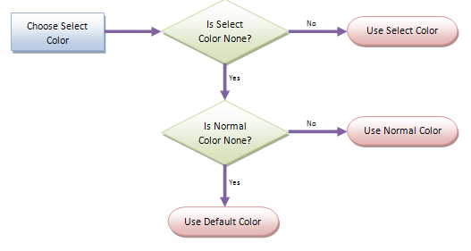
When the tab is selected, it will use the color field <3> if it exists. If not, then it uses the normal color in field <1> if it exists. If not, then the tab just uses the default system colors to draw the tab normally.
Each color pair consists of a text color and a background. The text colors use the Color technology, so you can use system colors, HTML colors, or absolute colors. The backgrounds use the advanced ColorFill technology, allowing for gradients and borders. You do not have to set both a text color and background. You can set one, the other, both, or neither as you see fit.
Backgrounds
How you set the background color of a tab will determine its overall look and feel. Since background use ColorFill technology, you can specify a single flag color, a gradient, a complex gradient, and even a border. Using a border has the biggest effect on how a tab will look. If you specify a color without a border, your tabs will something like this:
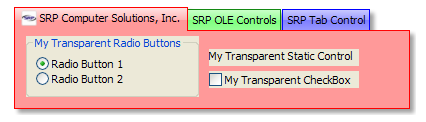
Since no border was established, the tab color was draw with a system colored sunken border around it. This gives a jeweled look to your tabs, especially if you use a gradient to give a shiny look to it. Now, if you use the same gradient above with a border, you see a more drastic difference:
In this case, the border caused the tab and the entire tab pane to be colored. The tab pane takes on a flat color appearance using the tab's border color for its edges and blending with the bottom of the tab.
The tab pane, in this case, is based on the Normal background (field <1>) only. Setting the other color pairs have no effect on the pane color, so be sure to test your other colors to ensure they look satisfactory with the pane color.
Pane Color
The fifth field allows you to provide a more complex color to your pane. Setting this field tells the control that you definitely want the pane to be colored regardless of the tab's background setting. The pane background is used only when that particular tab is selected. That way, you can change the pane background for each tab.
There are a few ways to approach colored panes, and like before, they depend on whether or not a border is established. First, let's look at what happens when you set a Pane color but leave the tab colors set to "None". There are two possibilities: a pane background with border and without. Omitting the border has a nice effect:
The tabs themselves look standard, but the pane uses a custom gradient. Even though the tabs look normal, they can each have their own pane background setting. So, the second tab can show a green pane while the third tab can show a blue one. Now, while you can add a border to the pane, it doesn't look good with standard tabs:
You may want to avoid using this particular combination.
Pane Colors with Tab Colors
Lastly, you can combine a custom pane background with custom tab colors. Once again, the affect depends on the use of borders. If you omit borders from both the tab and pane backgrounds, you get a sunken look throughout:

Note how the tab merges with the pane. Now, if you include borders for both the tab and pane backgrounds, you get this:

While it is possible to have borders on tabs on no border on panes, the result is not pleasant. It's best to stick with both or neither. Also, when using hot and selected colors, be sure to test their appearance when blended with the pane.
Custom Theme
One final thought. It is not necessary to use different colors for each tab as shown in these examples. You can also use the same color setting for every tab to create your own tab theme, so to speak. For example, using system colors as a base, you can create tabs that really stand out:

Example
// set a red, green, and blue tab without borders or custom panes
Colors = ""
Colors<1, 2> = "Vertical(Gradient(Red L=90, Red L=80), Gradient(Red L=75, Red L=80))"
Colors<2, 2> = "Vertical(Gradient(Red L=100, Red L=90), Gradient(Red L=85, Red L=90))"
Colors<3, 2> = "Vertical(Gradient(Red L=95, Red L=85), Gradient(Red L=80, Red L=85))"
Colors<4, 2> = "Vertical(Gradient(Gray L=90, Gray L=80), Gradient(Gray L=75, Gray L=80))"
Colors<5>    = "None"
rv = Set_Property(@Window:".OLE_TAB", "OLE.TabColors[1]", Colors)
Swap "Red" with "Green" in Colors
rv = Set_Property(@Window:".OLE_TAB", "OLE.TabColors[2]", Colors)
Swap "Green" with "Blue" in Colors
rv = Set_Property(@Window:".OLE_TAB", "OLE.TabColors[3]", Colors)
rv = Set_Property(@Window:".OLE_TAB", "OLE.AllowXPTheme", 0)

// set a red, green, and blue tab with borders and a custom pane
Colors = ""
Colors<1, 2> = "Vertical(Gradient(Red L=80, Red L=90), Border(Red))"
Colors<2, 2> = "Vertical(Gradient(Red L=90, Red L=95), Border(Red))"
Colors<3, 2> = "Vertical(Gradient(Red L=85, Red L=95), Border(Red))"
Colors<4, 1> = "Gray"
Colors<4, 2> = "Vertical(Gradient(Gray L=80, Gray L=90), Border(Gray))"
Colors<5>    = "Vertical(Gradient(Red L=95, Red L=80), Border(Red))"
rv = Set_Property(@Window:".OLE_TAB", "OLE.TabColors[1]", Colors)
Swap "Red" with "Green" in Colors
rv = Set_Property(@Window:".OLE_TAB", "OLE.TabColors[2]", Colors)
Swap "Green" with "Blue" in Colors
rv = Set_Property(@Window:".OLE_TAB", "OLE.TabColors[3]", Colors)
rv = Set_Property(@Window:".OLE_TAB", "OLE.AllowXPTheme", 0)

// set a custom theme to be used by all tabs
Colors = ""
Colors<1, 2> = "Vertical(Gradient(S L=95, S L=85), Gradient(S L=80, S L=85))"
Colors<2, 2> = "Vertical(Gradient(S C S=100 L=95, S C S=100 L=85), Gradient(S C S=100 L=80, S C S=100 L=85))"
Colors<3, 2> = "Vertical(Gradient(S C S=100 L=90, S C S=100 L=80), Gradient(S C S=100 L=75, S C S=100 L=80))"
Colors<4, 1> = "Gray"
Colors<4, 2> = "Vertical(Gradient(Gray L=90, Gray L=80), Gradient(Gray L=75, Gray L=80))"
rv = Set_Property(@Window:".OLE_TAB", "OLE.TabColors[All]", Colors)
rv = Set_Property(@Window:".OLE_TAB", "OLE.AllowXPTheme", 0)