The control color scheme.
Usage
Set_Property(OLECtrlEntID, "OLE.Colors", Array)
Values
Array has the following structure:
| Pos | Name | Type | Description | Default |
|---|---|---|---|---|
| <1> | Selected Items | |||
| <1, 1> | Text Color | Color | The selected item's text color | SelectText |
| <1, 2> | Background | Color Fill | The selected item's background | Select |
| <2> | Hot Items | |||
| <2, 1> | Text Color | Color | The hot item's text color | None |
| <2, 2> | Background | Color Fill | The hot item's background | None |
| <3> | Hot Selected Items | |||
| <3, 1> | Text Color | Color | The selected item's text color when hot | None |
| <3, 2> | Background | Color Fill | The selected item's background when hot | None |
| <4> | Selected Items without Focus | |||
| <4, 1> | Text Color | Color | The selected item's text color when there is no focus | 3DFace |
| <4, 2> | Background | Color Fill | The selected item's background when there is no focus | WindowText |
| <5> | Lines | Color | The color used to render hierarchy lines | GrayText |
| <6> | Insert Indicator | Color | The color used to render the insertion point indicator during drag and drop | WindowText |
| <7> | Empty Prompt | Color | The color used to render the prompt that appears when the control is empty | GrayText |
Remarks
The Colors property allows you to customize the SRP Tree Control's appearance.
The first four fields of this property establish the items' text and background colors. You can specify individual colors for each state the item can be in: Selected, Hot, Selected and Hot, and Selected without Focus. The text colors can be any valid Color, and the backgrounds can be any valid Color Fill.
When an item is at rest, then the ItemColors property is used.
The remaining fields allow you to customize a few other visual components of the SRP Tree Control: the hierarchy lines, the insert indicator used to provide feedback during drag and drop, and the color of the optional prompt that appears when the control is empty. All three of these elements can be set to any valid Color value.
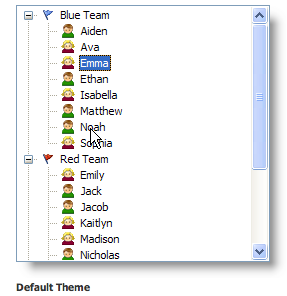
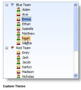
Here is a comparison of a custom themed tree control and the default theme:
To customize the tree control's background, use the Background property.
Example
// Customize the tree control theme
Colors = ""
Colors<1, 1> = "Black"
Colors<1, 2> = "Vertical( Gradient(S S=100 L=90, S S=100 L=80, 30%), Gradient(S S=100 L=75, S S=100 L=80), Border(S S=100 L=50) )"
Colors<2, 1> = "Black"
Colors<2, 2> = "Vertical( Gradient(S C S=100 L=90, S C S=100 L=80, 30%), Gradient(S C S=100 L=75, S C S=100 L=80), Border(S C S=100 L=50) )"
Colors<3, 1> = "Black"
Colors<3, 2> = "Vertical( Gradient(S S=100 L=95, S S=100 L=85, 30%), Gradient(S S=100 L=80, S S=100 L=85), Border(S S=100 L=50) )"
Set_Property(@Window:".OLE_TREE", "OLE.Colors", Colors)