Demonstrating the usefulness of caption lists and icon lists.
As mentioned in other topics, there are two ways to set the button's contents. The easiest way is to use the Caption and Icon properties at the cost of flexibility. Here are some ideas on how to use the CaptionList and IconList properties to better customize the button's appearance.
Single Caption
The CaptionList property meets the needs of developers that have long desired to have a single caption that is custom aligned. Coupled with the IconList property, developers can now make a button appear more complex.
When using only the Caption and Icon property, the best anyone could hope for was a button that looked something like this:
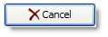
Set_Property(Ctrl, "OLE.Caption", "Cancel")
Set_Property(Ctrl, "OLE.Icon", "BMPS\delete.png")
With the CaptionList and IconList properties, you can make a button that looks like this:
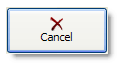
Set_Property(Ctrl, "OLE.CaptionList", "Cancel":@VM:@VM:"C6")
Set_Property(Ctrl, "OLE.IconList", "BMPS\delete.png":@VM:@VM:"C-6")
Multiple Captions
The reason we created the CaptionList and IconList properties in the first place was to meet the need of a client that wanted to emulate the buttons of a keyboard. This required multiple captions or images with a variety of layout and style options. Here is a sample button that uses two caption to emulate the '5' button on a typical keyboard:

BigFont = "Arial":@SVM:16:@SVM:700
LittleFont = "Arial":@SVM:10
CaptionList = ""
CaptionList<1> = "5":@VM:"C":@VM:"C":@VM:BigFont
CaptionList<2> = "%":@VM:"L3":@VM:"T3":@VM:LittleFont
Set_Property(Ctrl, "OLE.CaptionList", CaptionList)
Notice how each caption uses a different font. The main part of the key uses a larger font and is perfectly centered. A smaller font is used for the percent symbol and is offset relative to the top left corner.