The button's visual style.
Usage
Set_Property(OLECtrlEntID, "OLE.Style", OptionValue)
Values
OptionValue can be set to one of the following valid options:
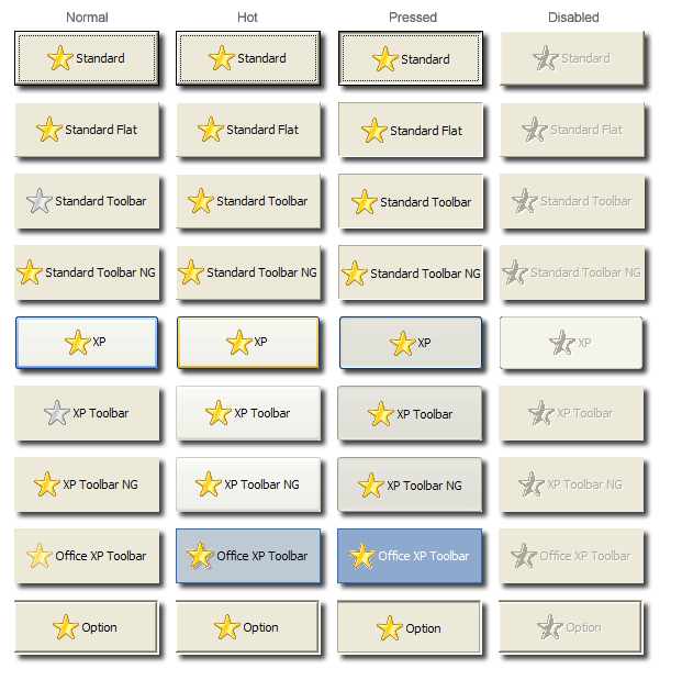
| Value | Abbr. | Description |
|---|---|---|
| Standard | STD | A standard windows button with a focus rectangle |
| Standard Flat | FLAT | A button with a thin border and no focus rectangle |
| Standard Toolbar | TB | A button with a thin border that appears when the cursor floats over it. The image is grayscale when at rest |
| Standard Toolbar NG | TBNG | Just like a Standard Toolbar button except the icon is always drawn in full color. (NG = Non-Grayscale) |
| XP | XP | A standard button drawn in the current XP theme. If no XP theme exists, acts as a standard button |
| XP Toolbar | XTB | A standard toolbar button drawn in the current XP theme. If no XP theme exists, then it is drawn like a standard toolbar button. |
| XP Toolbar NG | XTBNG | Just like an XP Toolbar button except the icon is always drawn in full color. (NG = Non-Grayscale) |
| Office XP Toolbar | OXP | A toolbar button drawn like the toolbar buttons in Office XP |
| Option | OPT | Makes the button appear to be embedded with a sunken border on all sides of the button except the left side. Placing a button of this style next to an edit line makes the button appear to be embedded within the right side of the edit line. |
| Custom Drawn | CD | Uses only the Icon image to draw the button. The icon will be scaled to fit the bounds of the control, allowing you to customize every pixel of the button. |
Default: Standard Toolbar
Remarks
This property establish how the control will appear on the form. By default, it is a standard toolbar button, but you may use the button as a standard push button, an option button, and an XP button.
Use the Option style to create a button that is meant to be next to an edit line control. If you carefully size and position the control, you can make an edit line control with a button that appears to be inside the edit control. When using an Option button, you can only place the button on the edit line's right side.
The XP styles allow your button to appear in the user's XP theme. If the user is not running under Windows XP, the button will default to the standard equivalent. Thus, an XP button will render as a Standard button if outside of Windows XP, the XP Toolbar will render as a Standard Toolbar, etc.
The Office XP style should not be confused with the other XP styles. The Office XP style emulates as close as possible the appearance of buttons in Microsoft's Office XP. This style is manually rendered and therefore works on any operating system.
Example
// Set the button to the XP standard button style
Set_Property(@Window:".OLE_BUTTON", "OLE.Style", "XP")

// Set the button to the Office XP toolbar button style
Set_Property(@Window:".OLE_BUTTON", "OLE.Style", "Office XP Toolbar"