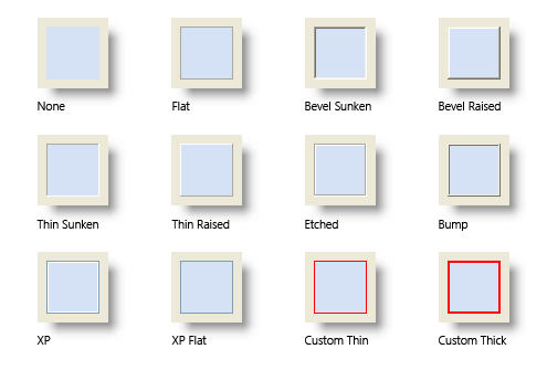
The control's border style.
Usage
Set_Property(OLECtrlEntID, "OLE.Border", OptionValue)
Values
OptionValue can be set to one of the following valid options:
| Value | Abbr. | Description |
|---|---|---|
| None | N | No border |
| Bevel Sunken | BS | A thick sunken border |
| Bevel Raised | BR | A thick raised border |
| Thin Sunken | TS | A thin sunken border |
| Thin Raised | TR | A thin raised border |
| Etched | ET | An etched border |
| Bump | B | A bumped border |
| Flat | F | A thin system themed border |
| XP | X | A 2-pixel border with a blue outline drawn in standard XP theme, or Bevel Sunken if XP themes are disabled |
| XP Flat | XF | A 1-pixel blue border drawn in standard XP theme, or Flat if XP themes are disabled |
| Custom Thin | CTN | A 1-pixel border of any color, which is determined by the BorderColors property. |
| Custom Thick | CTK | A 2-pixel border of any color, which is determined by the BorderColors property. |
Default: None
Remarks
The Border property establishes the kind of border to appear around the edges of the control. There are several types of borders as visualized below:
Example
// Use the XP border
Set_Property(@Window:".OLE_CONTROL", "OLE.Border", "XP")
